Hey there, home improvement enthusiasts! Have you ever walked into a room and immediately felt a certain way? Maybe calm in a sage green bedroom or energized in a bright yellow kitchen? That’s the power of color psychology at play in interior design. Colors are not just aesthetic choices; they influence our mood, feelings, and even behavior. In this article, we’ll dive into the fascinating world of color psychology and explore how different hues can transform your spaces. Ready to add a splash of color psychology to your home? We’ve run through the basic design tenets associated with each color, and included our favorite matching paint colors from both Sherwin Williams and Benjamin Moore. Let’s get started!
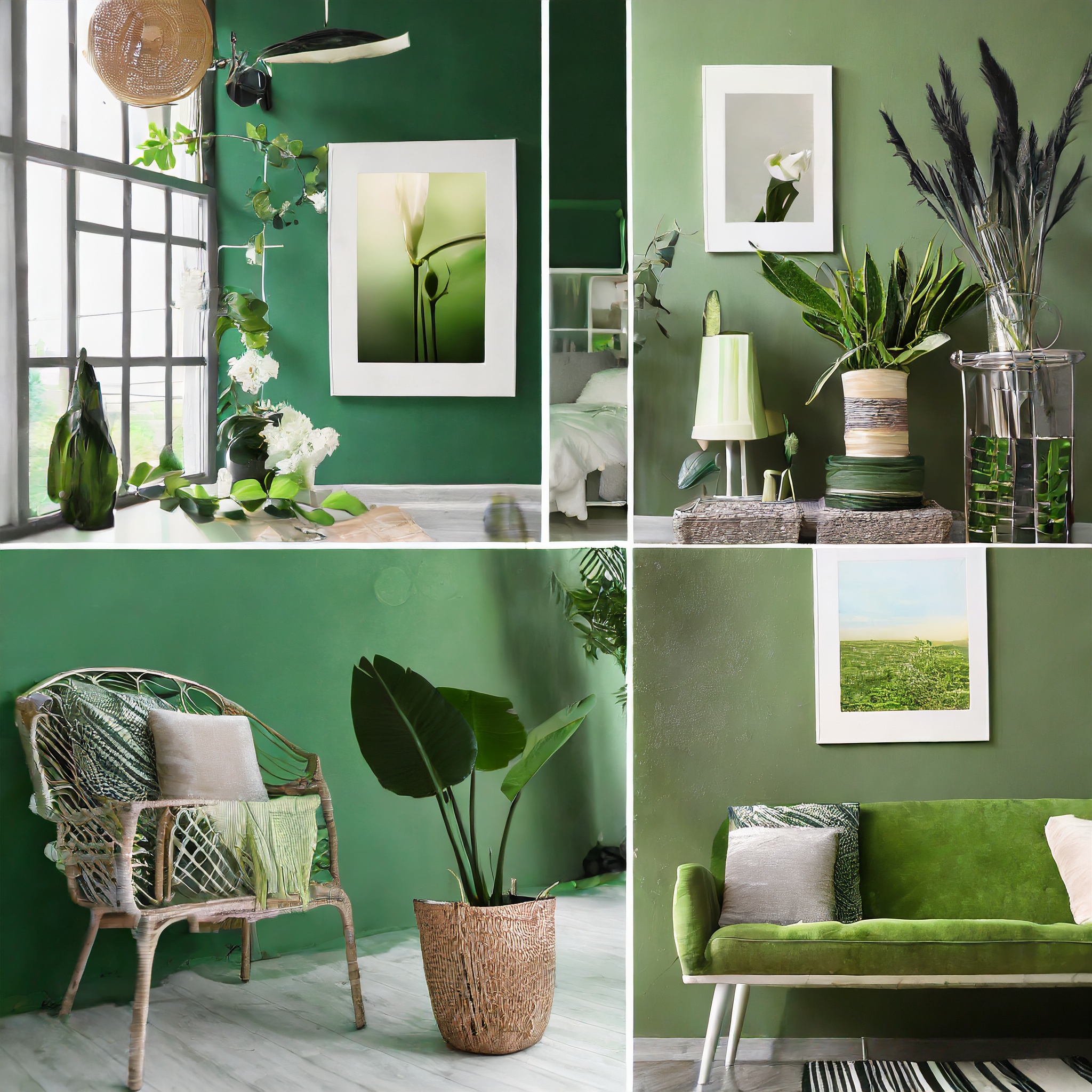
Green: The Soothing Sanctuary
Picture this: a room bathed in soft, leafy green hues. Green, the color of nature, is a no-brainer for creating serene and calming environments. Why? It’s all about the tranquility that green spaces in nature provide. A green-themed room can be your personal retreat, a place to unwind and recharge. Imagine a bedroom with sage green walls or a bathroom with minty accents – pure relaxation!
Theory: Green, emblematic of nature, is renowned for its calming properties. It’s ideal for crafting tranquil, restful spaces.
Decor Ideas: Incorporate indoor plants, botanical prints, and natural wood elements to enhance the green theme, creating a harmonious, nature-inspired space.
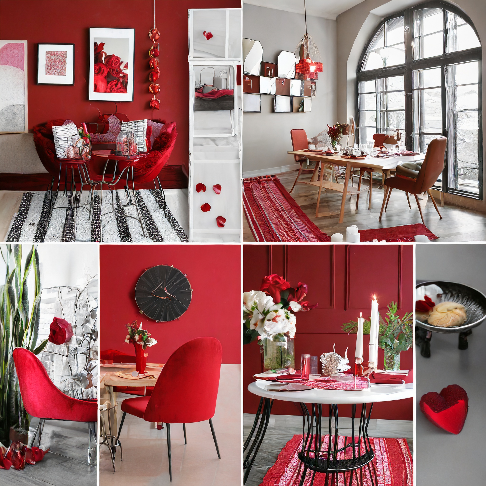
Red: Dining with Dynamism
Red, the color of passion and appetite, is perfect for dining areas. Ever wondered why many restaurants use red? It’s stimulating, increases appetite, and invites lively conversations. But a word of caution: too much red can be overpowering. So, think of a feature wall in your dining room or red decor accents that enliven mealtime without overwhelming the senses.
Theory: Red is stimulating and encourages hunger and conversation, making it a fitting choice for dining areas.
Decor Ideas: Consider red table linens, artwork with warm hues, or a single red accent wall to invigorate the dining experience without overwhelming the senses.
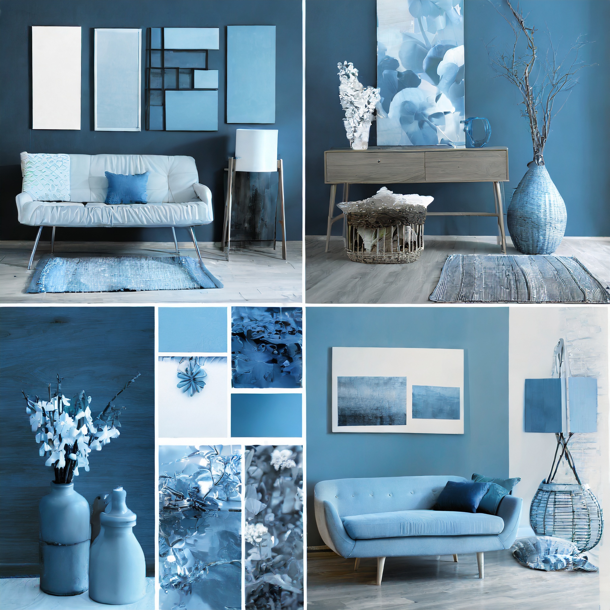
Blue: Productivity Powerhouse
Blue, especially in its lighter shades, is a go-to color for creating productive and focused spaces. It’s the color of the sky and the sea, symbolizing openness and clarity. A home office in sky blue or a study with navy accents can boost concentration and efficiency. It’s like having a piece of the clear, open sky right in your room!
Theory: Lighter shades of blue promote productivity and focus, reminiscent of the clear sky and tranquil seas.
Decor Ideas: Opt for blue office chairs, curtains, or rugs. Pairing blue with white or silver accents can further enhance the feeling of clarity and focus.
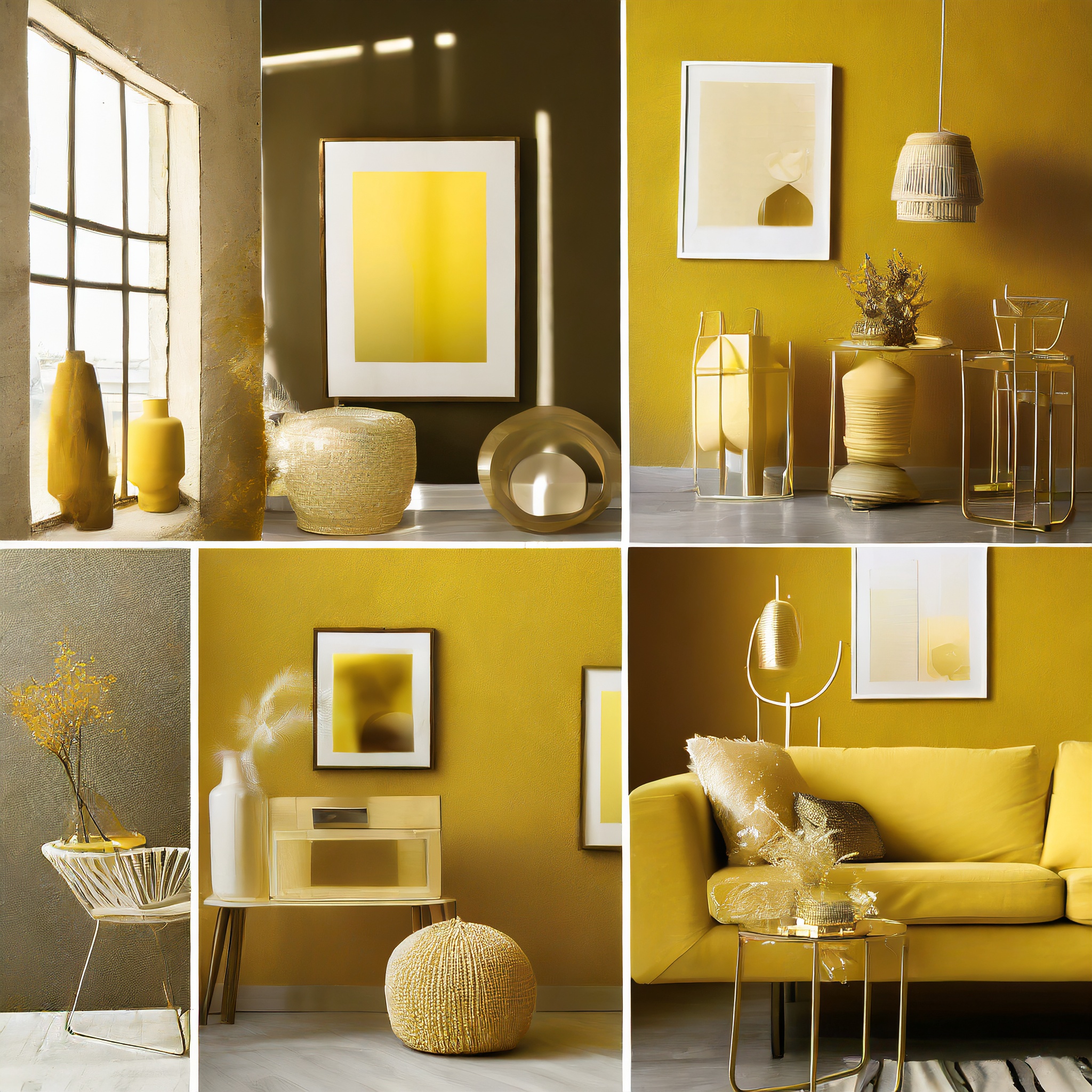
Yellow: The Sunshine Effect
Hello, happiness! Yellow, the brightest color on the spectrum, is all about joy and energy. A kitchen or living room with yellow tones feels sunny, welcoming, and vibrant. But remember, it’s a bold color. Soft, buttery yellows work wonders in larger spaces, while bright lemony shades are perfect for smaller accent pieces.
Theory: Yellow, the brightest color, infuses spaces with joy and vitality, ideal for kitchens and living rooms.
Decor Ideas: Soft yellow walls can be complemented with white kitchen cabinets or living room furniture, while brighter yellow accessories can add pops of cheer.
Purple: Luxury and Creativity
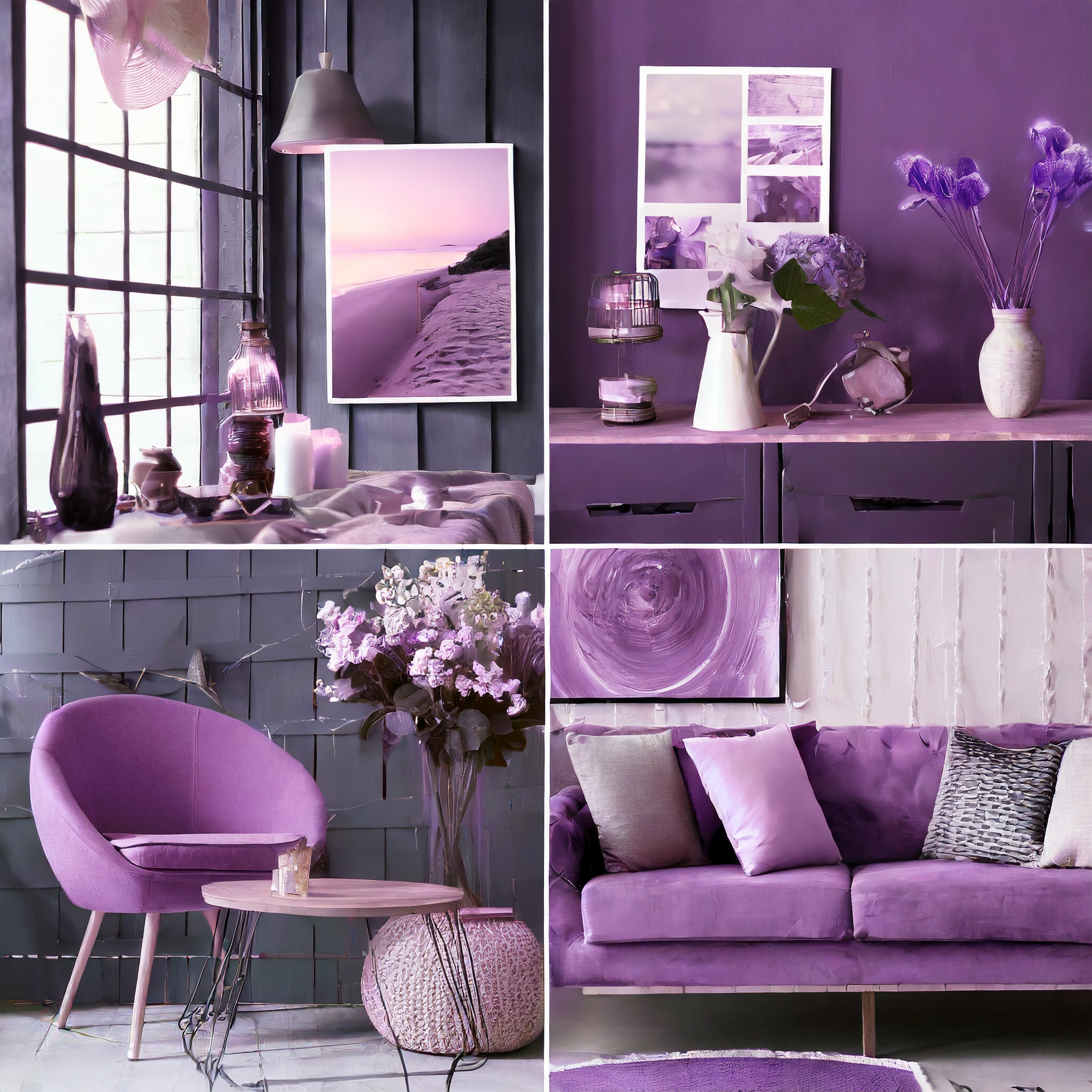
Purple, historically the color of royalty, exudes luxury and creativity. It’s a bold choice but can add a touch of sophistication and imagination to any space. Think about using a regal dark purple or aubergine for an accent wall in your living room or lavender in a creative workspace. Purple can turn a regular room into a regal and inspiring haven.
Theory: Purple, historically associated with royalty, brings an air of sophistication and sparks creativity.
Decor Ideas: Use purple in accent pillows, wall art, or an accent wall. Balance it with neutral tones for a luxurious yet grounded ambiance
Orange: Warmth and Energy
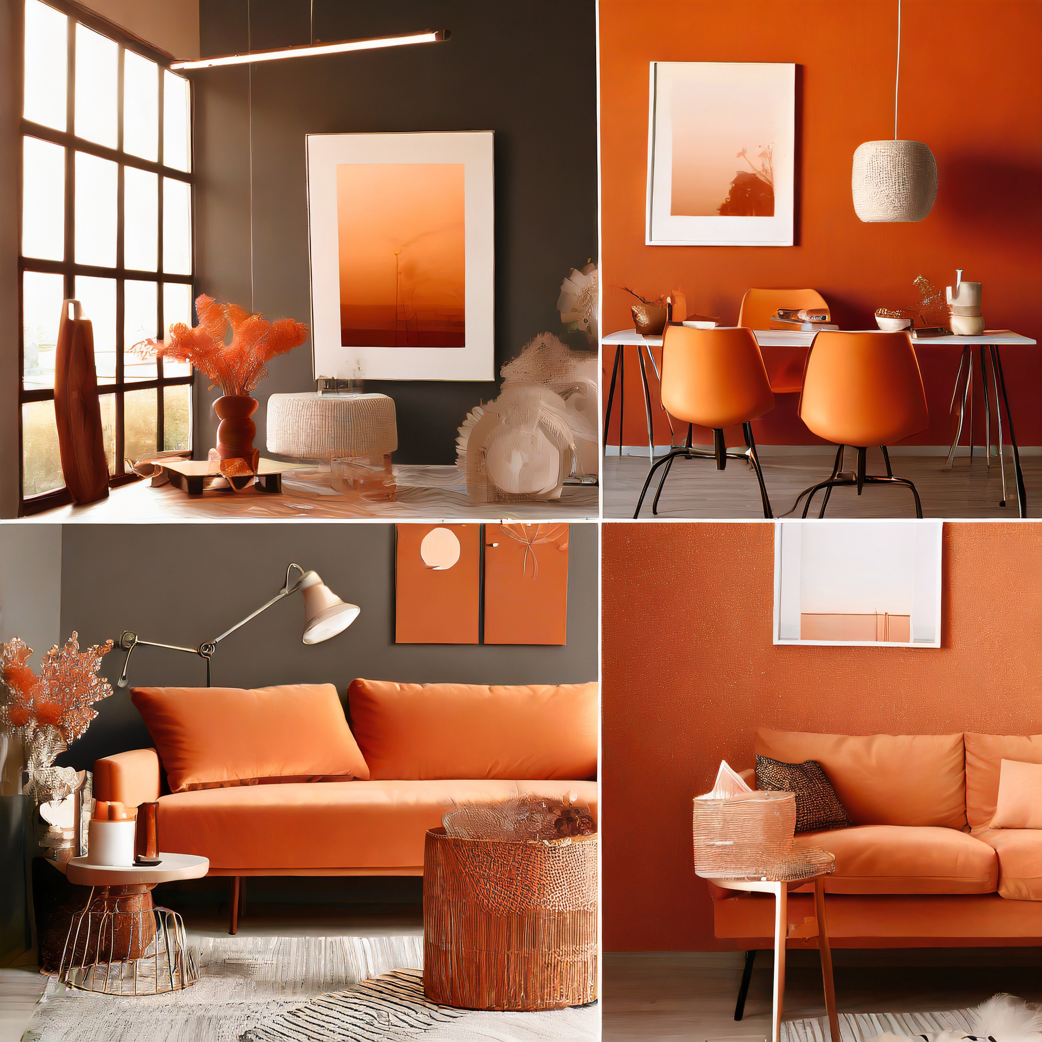
Orange combines the energy of red and the happiness of yellow. It’s perfect for spaces where you want warmth and vitality. A workout room with orange accents can boost your energy levels, while a living room with terra cotta walls can feel cozy and inviting. Just the right amount of orange can make a room feel like a sunny autumn day, all year round.
Theory: Orange is perfect for spaces where you seek warmth and invigoration.
Decor Ideas: Incorporate orange in throw blankets, lampshades, or wall décor in exercise or family rooms to create a lively and inviting atmosphere.
White: The Minimalist’s Dream
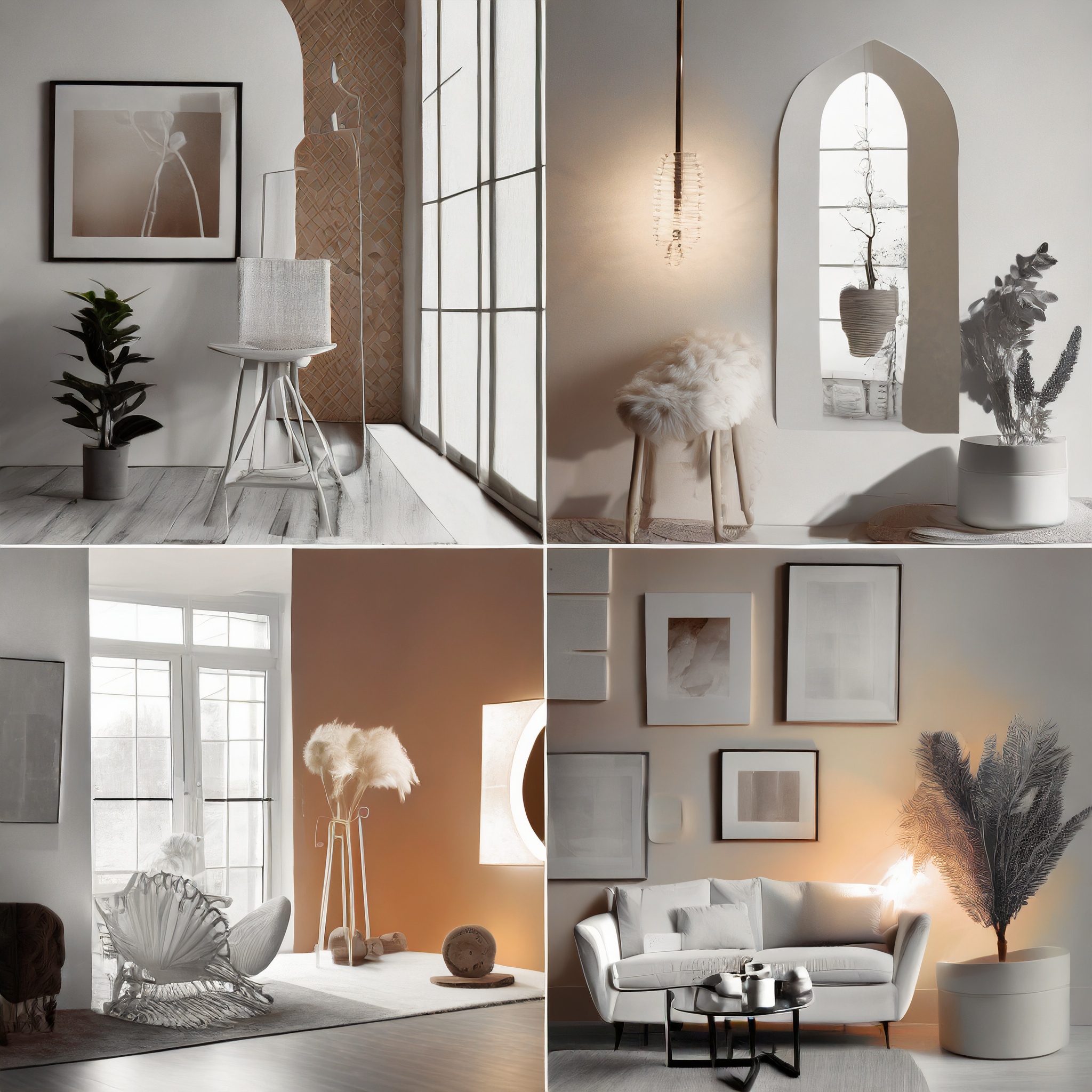
White isn’t just a lack of color – it’s the epitome of simplicity and cleanliness. It creates a sense of space and clarity, making it ideal for minimalist designs. A white-themed room feels open, airy, and peaceful. It’s like a blank canvas, ready for your personal touches. Plus, it’s incredibly versatile, matching any other color you pair it with!
Theory: White signifies simplicity and clarity, creating a sense of space and peace, ideal for minimalist designs.
Decor Ideas: Use white in large areas like walls or curtains, complemented by subtle color accents in decor items to maintain a clean, serene ambiance.
Black: Bold and Elegant
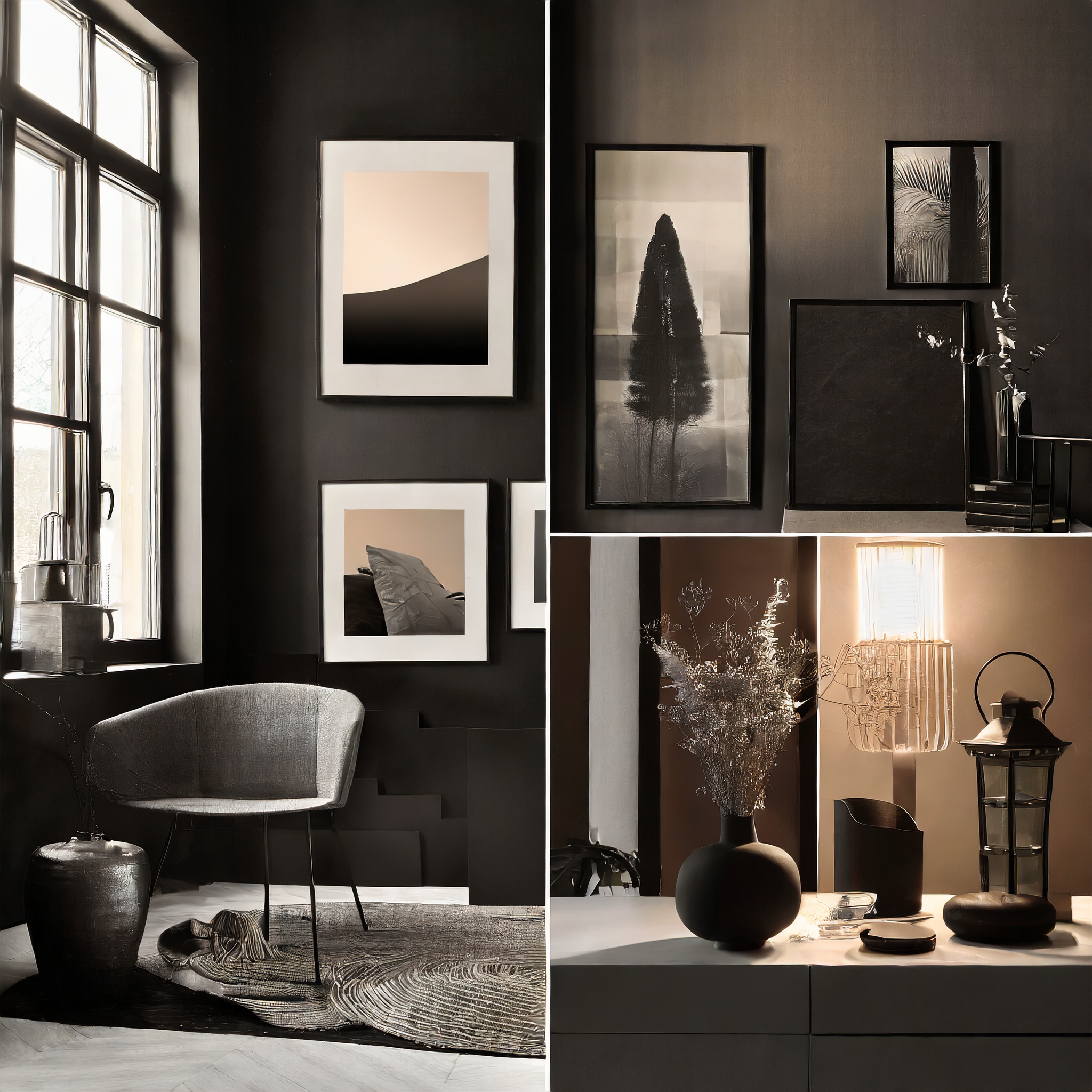
Black in interior design? Absolutely! It’s bold, elegant, and when used right, incredibly stylish. Think of a black feature wall, chic black furniture, or even black accents in a room. It creates depth and drama, giving your space a modern, sophisticated look. But remember, balance is key – too much black can feel oppressive.
Theory: Black, used judiciously, brings an element of sophistication and depth to interior design.
Decor Ideas: Black furniture, feature walls, or frames can create a dramatic yet elegant look. Pair with lighter colors to balance the boldness.
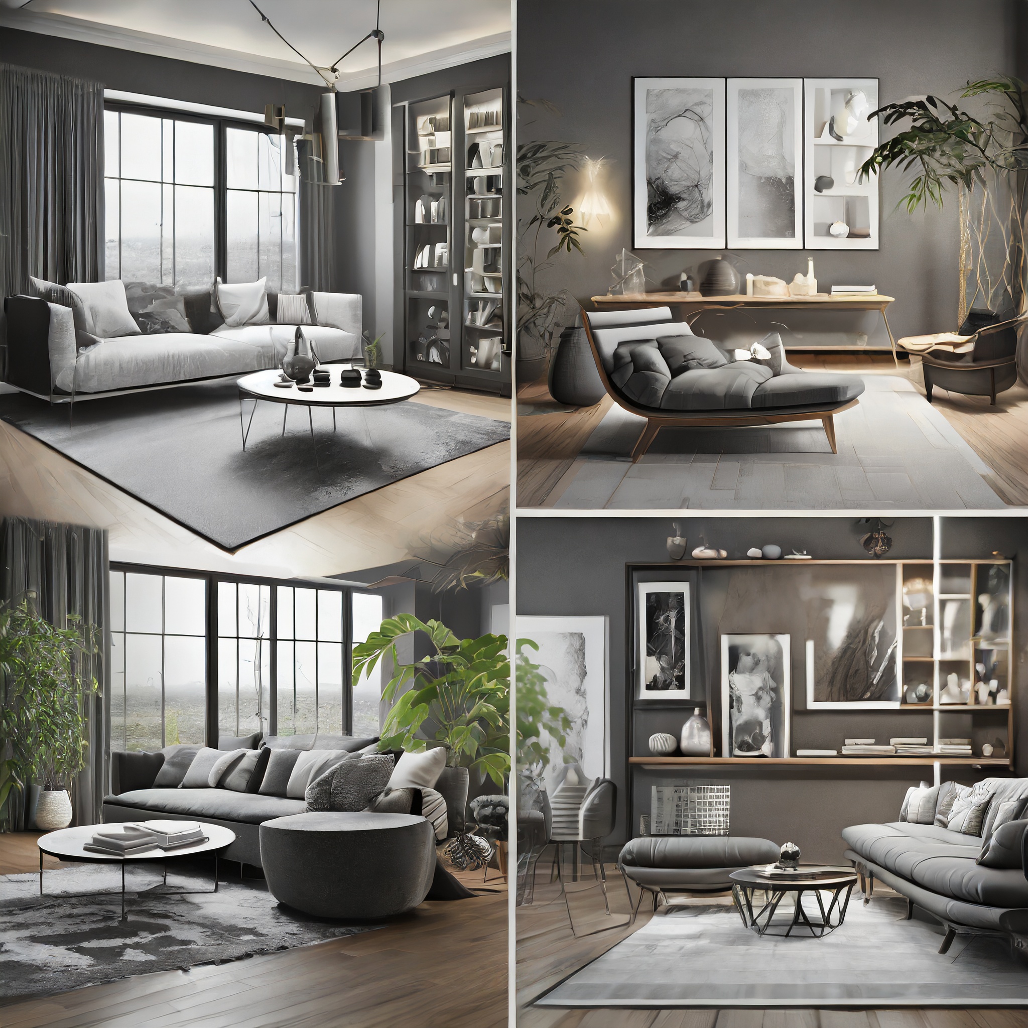
Grey: The Modern Neutral
Grey is the new neutral, perfect for contemporary, chic designs. It’s versatile, sophisticated, and pairs well with almost any color. A living room with soft grey walls can be a backdrop for vibrant art or a cozy nook with plush, colorful cushions. Grey is like the quiet, confident type – unassuming yet incredibly stylish. It’s worth noting that grey themes have some negative connotations in remodeling: Many people paint their home grey ahead of selling to make it appear as an empty canvas to potential buyers, and landlords are known to paint rental units grey to appeal to a wider audience.
Theory: Grey is the contemporary neutral, versatile and sophisticated, ideal for modern interior designs.
Decor Ideas: Grey sofas, rugs, or wall paint work well as a base, which can be livened up with colorful accessories like cushions or art.
And there you have it – a rainbow of colors and their psychological impacts in interior design. Remember, the best color for your space is one that reflects your personality and fits your lifestyle. Don’t be afraid to experiment and have fun with colors. After all, your home is your canvas – paint it in the colors that make you happy!
Further Reading:
- Interior Design: Understanding the Psychology of Color in Spaces – stoneside.com
An in-depth exploration of how different colors influence interior design and mood. - Color Theory Basics: How To Use Color Theory in Interior Design? – Foyr.com
A comprehensive guide to using color theory effectively in home decoration. - Interior Design Color Psychology: Best Hues for Every Room – decorilla.com
Practical tips and tricks on applying color psychology principles to create rooms that match desired emotions and functionalities.

